As spring slowly makes it appearance in the Midwest, homeowners and landscapers are likely to continue discovering damage from our record-breaking winter. While brutally cold temperatures and heavy snow loads took their toll in many areas, some of the most severe damage that occurred to landscape trees and shrubs this winter was caused by mammals.
Our long, harsh winter resulted in heavy feeding damage by deer, rabbits and voles, also called field mice. Depending on the age and type of plant and which animal was feeding on it, mammal damage can range from light pruning to death of a tree or shrub. Developing a strategy to deal with animal damage requires proper identification of the offender. Here are clues to identifying mammal damage.
Vole damage
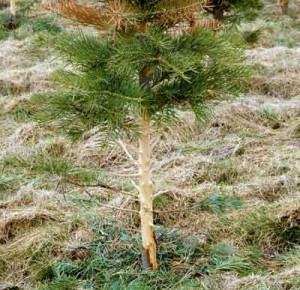
Voles or field mice are small rodents that gnaw on tree and shrub stems. Voles do not hibernate and are active throughout the winter under snow, so feeding damage that occurred near ground-line when the ground was covered with snow is likely vole damage. Although they are small, voles can wreak a lot of havoc. They can easily kill small trees or branches on larger trees by girdling stems, or removing the bark around the entire circumference.
Deer damage
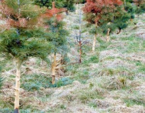
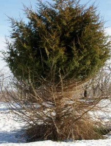
During the winter, deer feed on the ends of many types of trees and shrubs. Evergreens, especially arborvitae, are among their favorites. In most landscapes in this area, a “browse line” is a common feature on arborvitae. Eastern white pine, maples, birch, dogwoods and viburnums are also favored trees deer browse. This winter, I received reports of deer browsing on secondary species, such as Austrian pine, reflecting the severity of the winter.
Rabbit damage
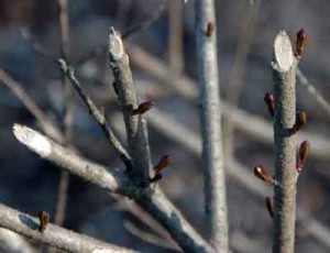
Rabbits can cause damage that may resemble feeding by either voles or deer. Like deer, rabbits will chew the ends off of deciduous trees and shrubs. A close inspection of the end point will often indicate the culprit: rabbits typically leave a clean, angled bite mark, whereas deer tear or break stems, leaving a rough edge. Like voles, rabbits can also girdle stems of trees and shrubs. In winters with heavy snow cover like this one, the height of the damage can provide a clue; vole damage will extend down to the soil surface, while rabbits work above the snow-line.
Managing mammal damage
Managing mammal damage is often difficult and multiple strategies may be needed. Excluding deer with fencing can be highly effective, but is not practical in many instances. Deer repellents can also be effective, but may wear off over time or become less effective as deer become hungrier as winter wears on. Around our place, our dogs to a good job of keeping deer and rabbits at bay, but of course require their own care and feeding.
Reducing weeds and ground cover can help to reduce damage by rodents by eliminating cover from their predators. Trapping may be effective for controlling rabbits, but is usually not practical for voles. Baiting can be used for voles, though care must be taken to avoid poisoning non-target animals. In some situations, erecting raptor perches can also be helpful in keeping rodent populations down.
