I’m attending the American Society for Horticultural Science (ASHS) meeting this week in sunny (and hot) Palm Desert, CA. Tomorrow I will be presenting some of the early results from the SOME-DED-TREES study. For those that are new to the blog, SOME-DED-TREES is the acronym for the Social Media DesigneD TREe Establishment Study. Last year, my students and I established a landscape tree study in which the treatments were suggested by Garden Professor’s blog readers. Actually, we ended up installing two studies: one to look at fertilization at planting and one to look at impacts of mulching at planting. The trees were ‘Bloodgood’ planetrees grown in 25 gallon containers. In each study we divided the trees into three root treatments: We “shaved” the outer roots to eliminate circling roots; we “teased” apart the circling roots; or we just planted the trees as is (or “Pop and drop” to use Linda’s vernacular).
I reported some of the results of the mulch study here on the blog last fall and will include some of those data in my talk tomorrow. I am also presenting some of the data from the fertilizer portion of the study. One of the ways we assessed fertilizer response is by using a device known as a SPAD meter.
SPAD meters have been around for a while and they are very useful. The device measures light transmittance through a leaf, which is highly correlated with leaf chlorophyll content. Chlorophyll content, in turn, is highly dependent on foliar nutrition so SPAD readings often provide a useful indicator of plant nutrient status.
Here at the meeting I am using my laptop, which means I am without my usual statistical and graphing software. So in order to plot some of the data for my talk I am relying on Excel. This gets me to “How to lie with statistics.” When I calculated the means for this June’s SPAD chlorophyll index values this is the chart I got. Looks like a pretty impressive response to fertilizer, doesn’t it?
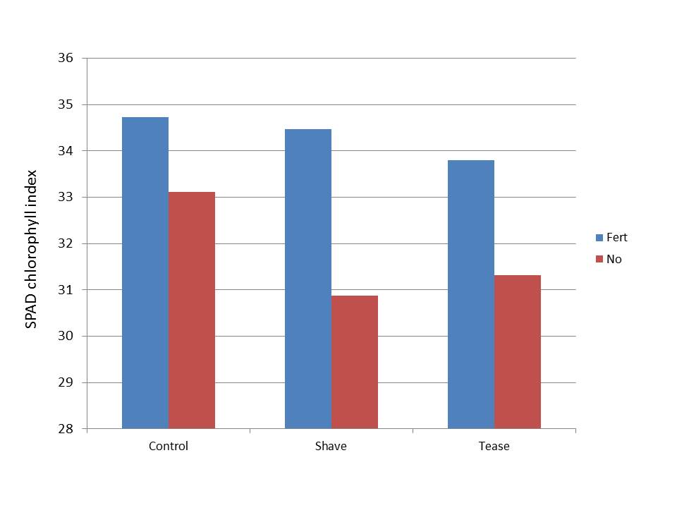
SPAD chlorophyll index of Planetrees fertilized at plant (Fert) and control trees (No).
The problem is the scale. Note that by default, Excel truncated the scale on the y axis to values between 28 and 36. This is a big no-no in scientific circles. Graphs scales should include zero or show if break if there is some reason the range needs to be truncated. The reason truncating the scale is a no-no, as shown here, is that it makes differences look proportionately larger than they really are. Advertisers use this trick all the time. Next time you see a bar chart in a sales brochure or magazine ad, look that the scale – bet it doesn’t go to zero.
Let’s look at the chart after I re-scale it. It still looks like there’s still something going on with fertilizer, but it doesn’t make you go, “Whoa!” like the first chart.
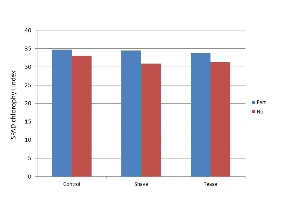
SPAD chlorophyll index of Planetrees fertilized at plant (Fert) and control trees (No).
As it turns out, there is a statistically significant effect of fertilizer on the June SPAD values. However, this effect essentially disappeared by the time we re-assessed the trees three weeks later. Here’s the final version of the data as it will appear in my ASHS talk tomorrow.

This brings up another issue we face in this kind of work; statistical significance versus biological or practical significance. The ‘Fert: p<0.01’ on the slide indicates there is a 99% probability that the difference in the mean SPAD values between Fertilized and Non-fertilized trees on June 17 is not due to random chance or error. But as the leaves continue to mature this effect essentially disappears. Could the early season boost in nutrition be enough to give these trees an edge in the long run? Possibly, but I wouldn’t say likely. To date we have not seen any effects of fertilizer on growth but it’s still relatively early in the game. Tree growth is cumulative and effects that may be too subtle to detect early on may turn out to be significant later on. Stay tuned.
How much time elapsed between planting and taking the measurements?
I was wondering why you did not include error bars.
Robert:
The trees were planted and fertilized in May 2012. So a little over a year.
Jeanne: That’s part of the ‘Lying with statistics’ theme… Just kidding. I’d certainly include error bars for a publication. As I noted, I was working with Excel and PowerPoint, which are not very good for doing error bars (unless you have a trick I don’t know about). For the talk at the meeting (last graph) I e-mailed the data to my technician back at the lab, who ran the analysis of variance. Fertilizer effect was significant on the first date (June) but not on the second (July).